NOVOA BANDING AND IDENTITY DESIGN
Logo Design
Logo Exploration
Logo Animation
Make impact and grab your audience’s attention with logo animation to promote your company’s products and mission across all touchpoints including video display, apps, websites and social marketing.
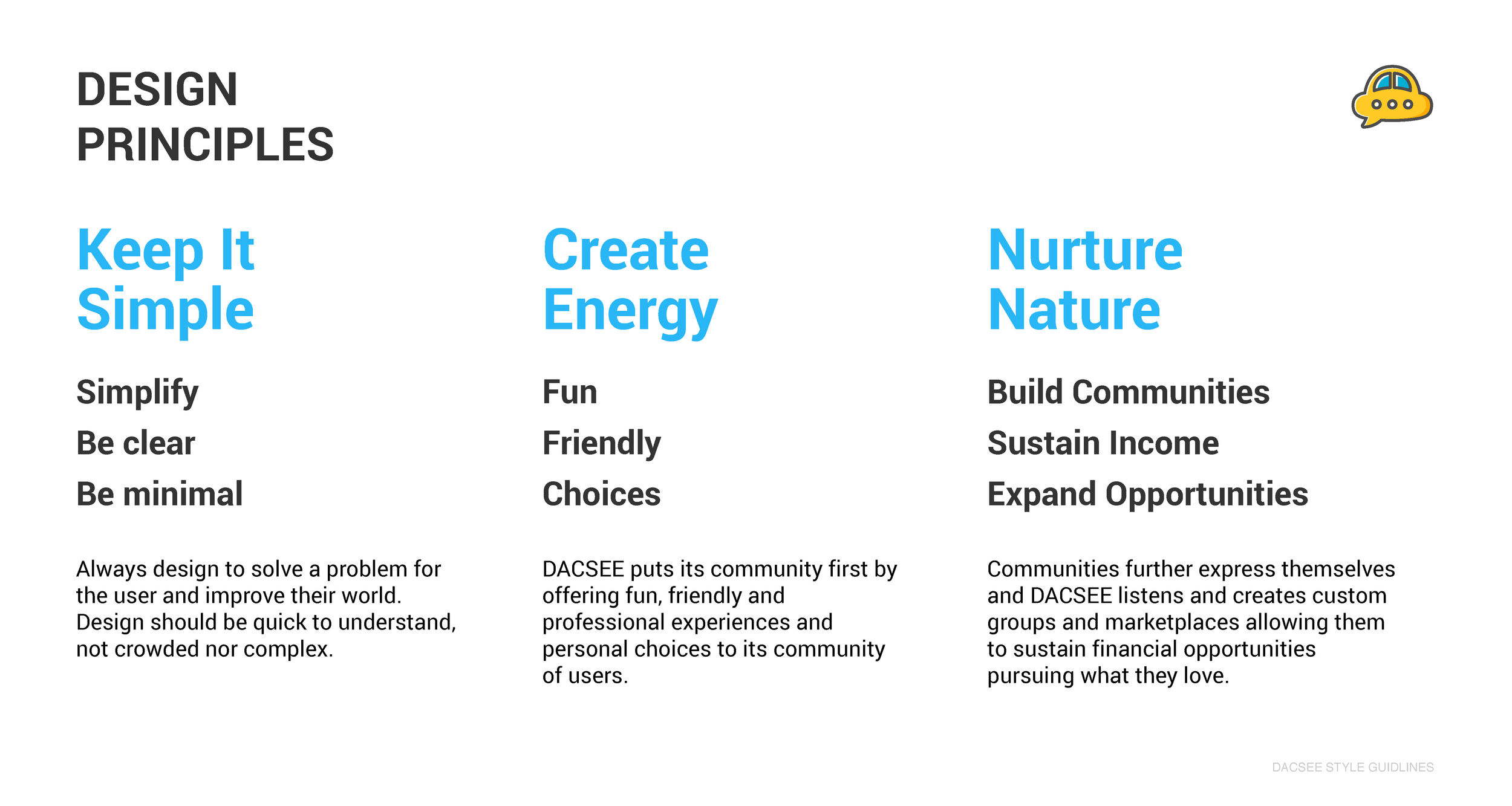
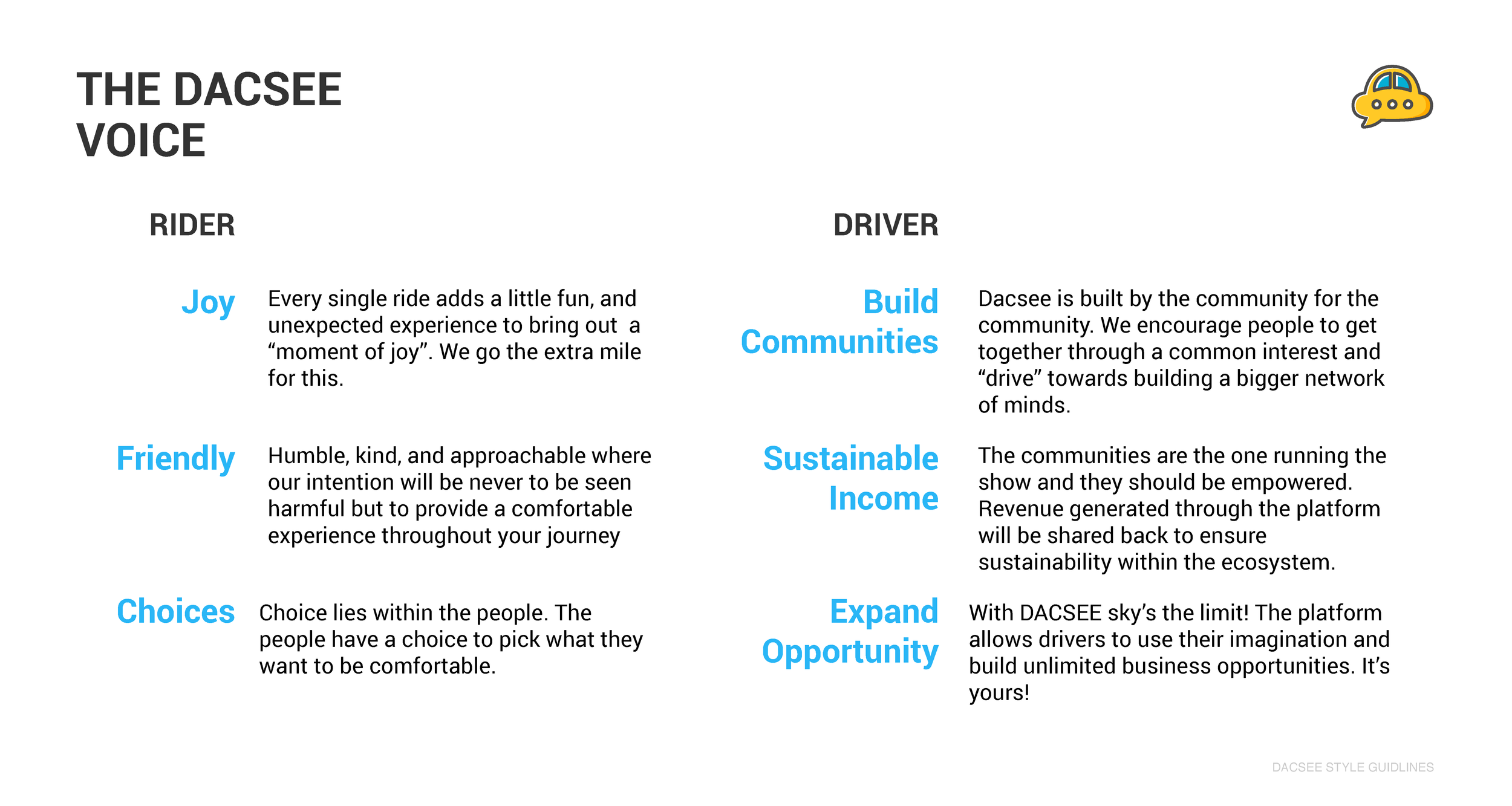
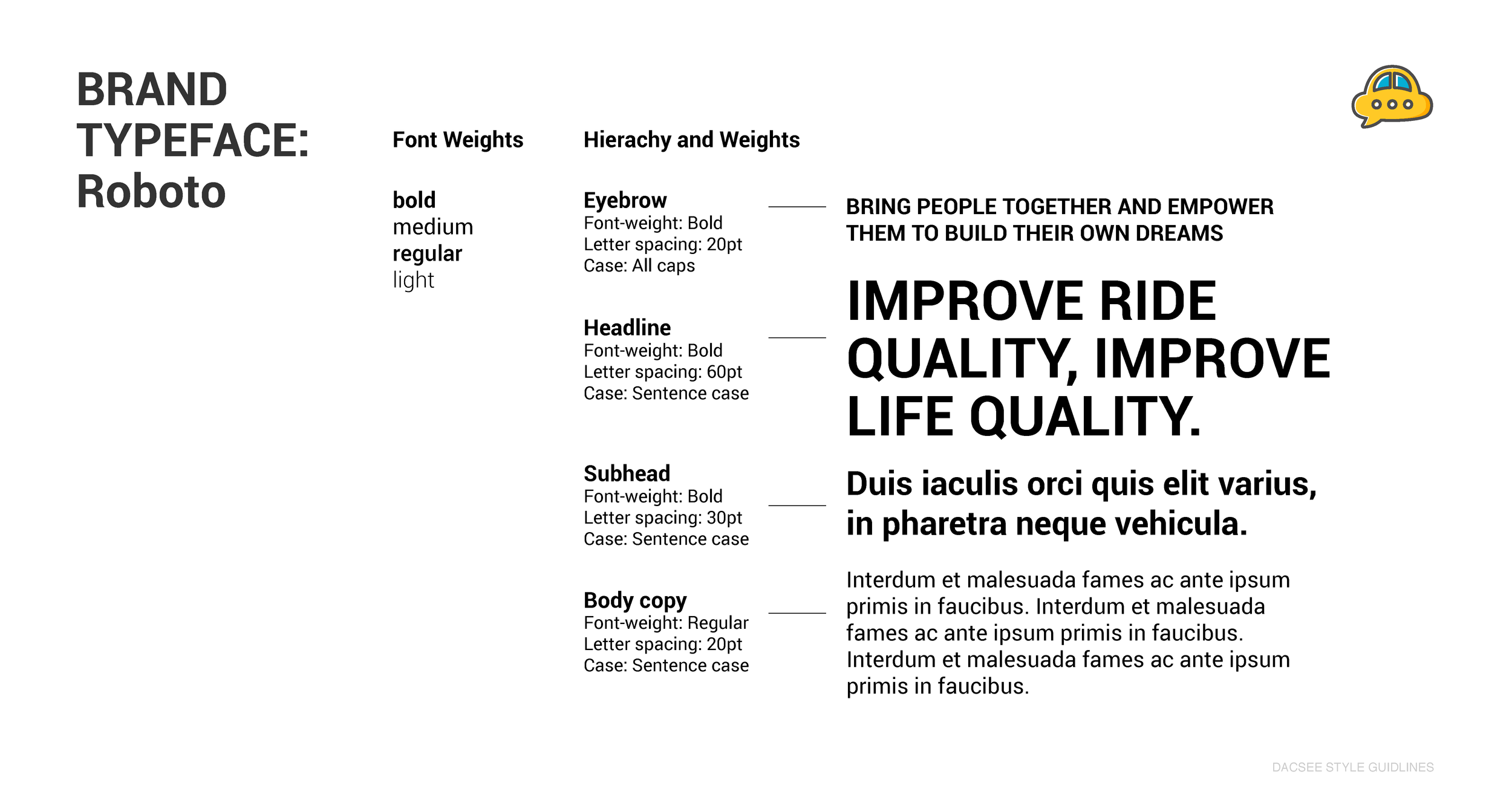
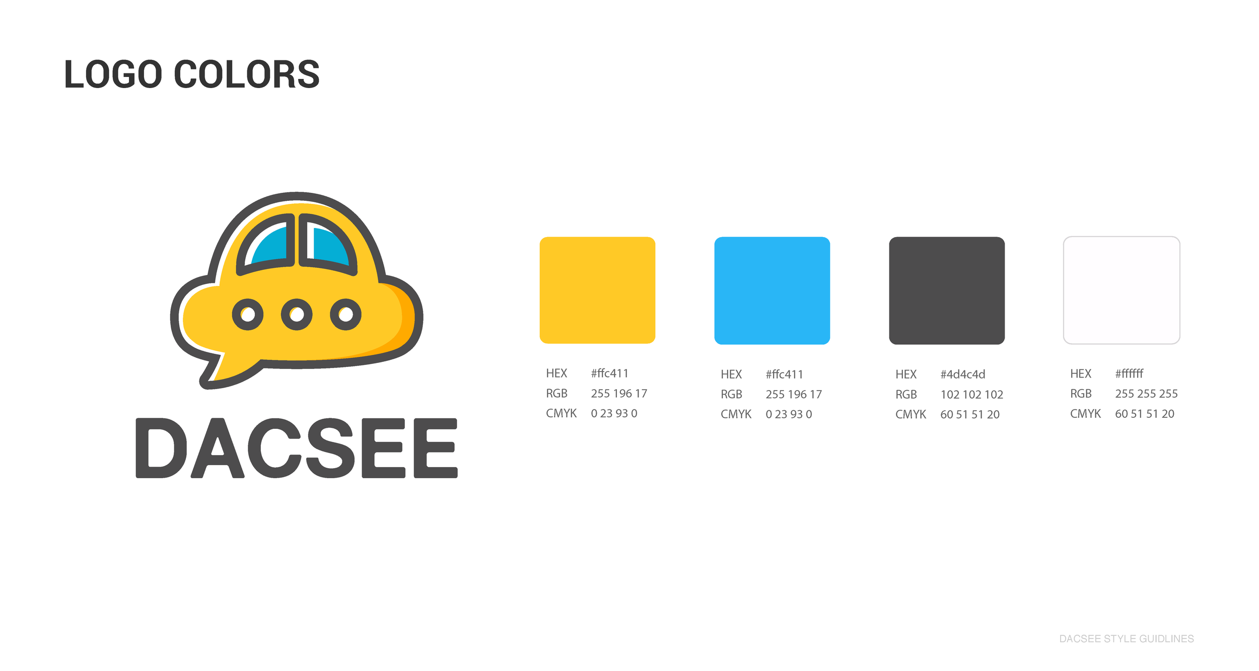
Branding Style Guides
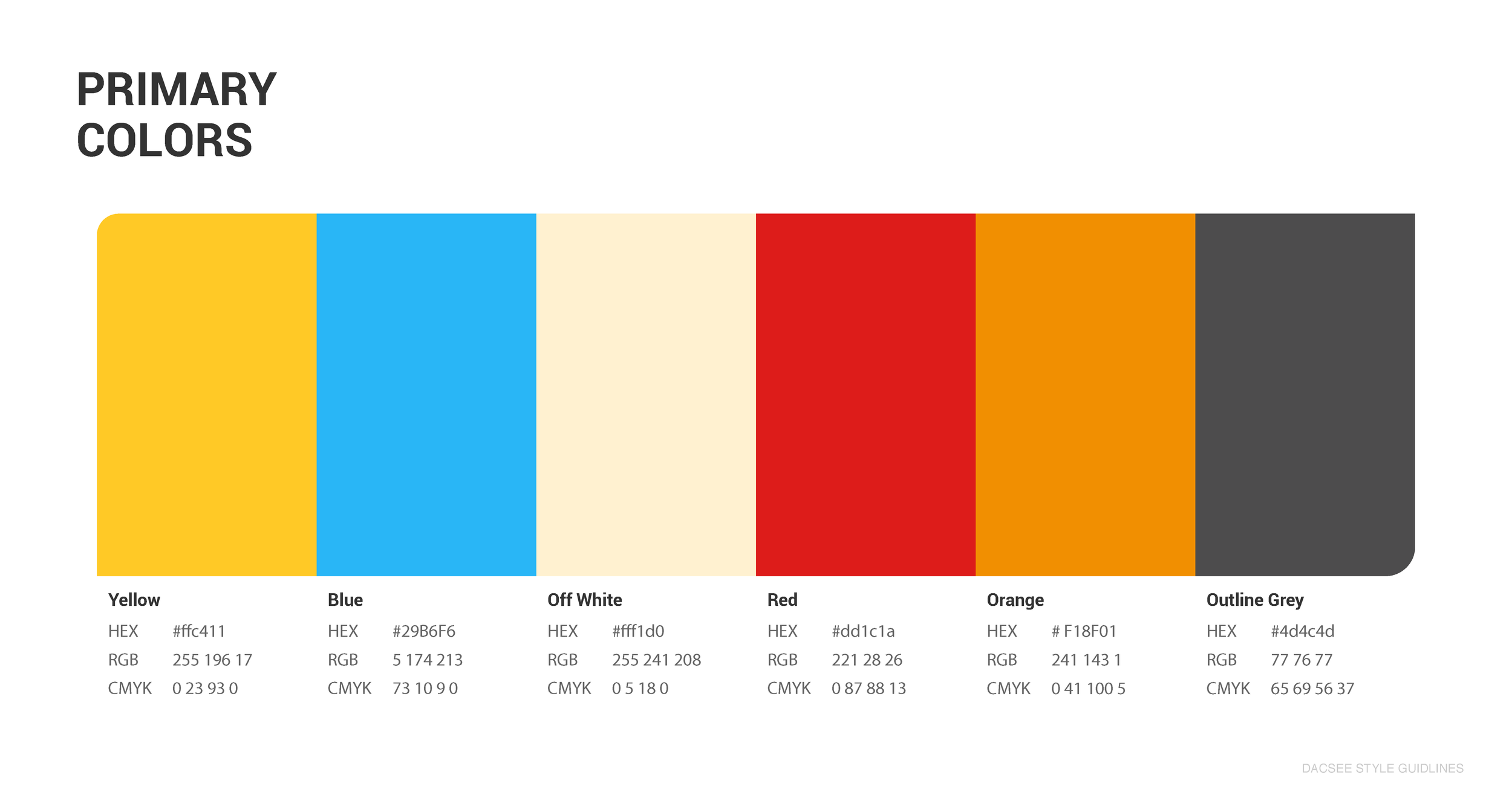
Good branding comes from a good blueprint. Our first priority for branding efforts is building a clear style guide which breaks down what the brand is, how it should be represented across various mediums, and has all the subtle nuances which makes a brand what it is. This is the blueprint for building a brand that truly speaks to the marketplace. We boil down the elements of the brand into everything from general tone of writing, to specific font choices across print and web, general color schemes and more.
Ready to get started on your Branding and Identity Design Project?
Interested in learning more about logo design and logo types?
No problem read below:
Iconic/Symbol
Icons and symbols are compelling yet uncomplicated images that are emblematic of a particular company or product. They use imagery that conveys a literal or abstract representation of your organization. Symbols are less direct than straight text, leaving room for broader interpretation of what the organization represents. In order for a symbol to be a truly effective logo, it should conform to these maxims:
Instantaneously Recognizable
Memorable
Clarity when reproduced in small sizes
Can be illustrative in nature, either concrete or abstract
Logotype Wordmark
A logotype, commonly known in the design industry as a "word mark", incorporates your company or brand name into a uniquely styled type font treatment. Type fonts come in thousands of possible variations, shapes, sizes, and styles, each conveying a slightly different impression upon your intended audience. Script fonts imply a sense of formality and refinement. Thick fonts proclaim strength and power, whereas slanted type fonts impart a sense of motion or movement. Type font treatments can also include hand-drawn letters, characters or symbols that have been rendered in such a way as to intrigue the eye and capture the interest. Images can also be integrated into a logotype, often to great visual effect. Of prime consideration when selecting a logotype or wordmark is legibility and ease of recognition, even when reduced to the size required for printing your business cards.
Combination Marks
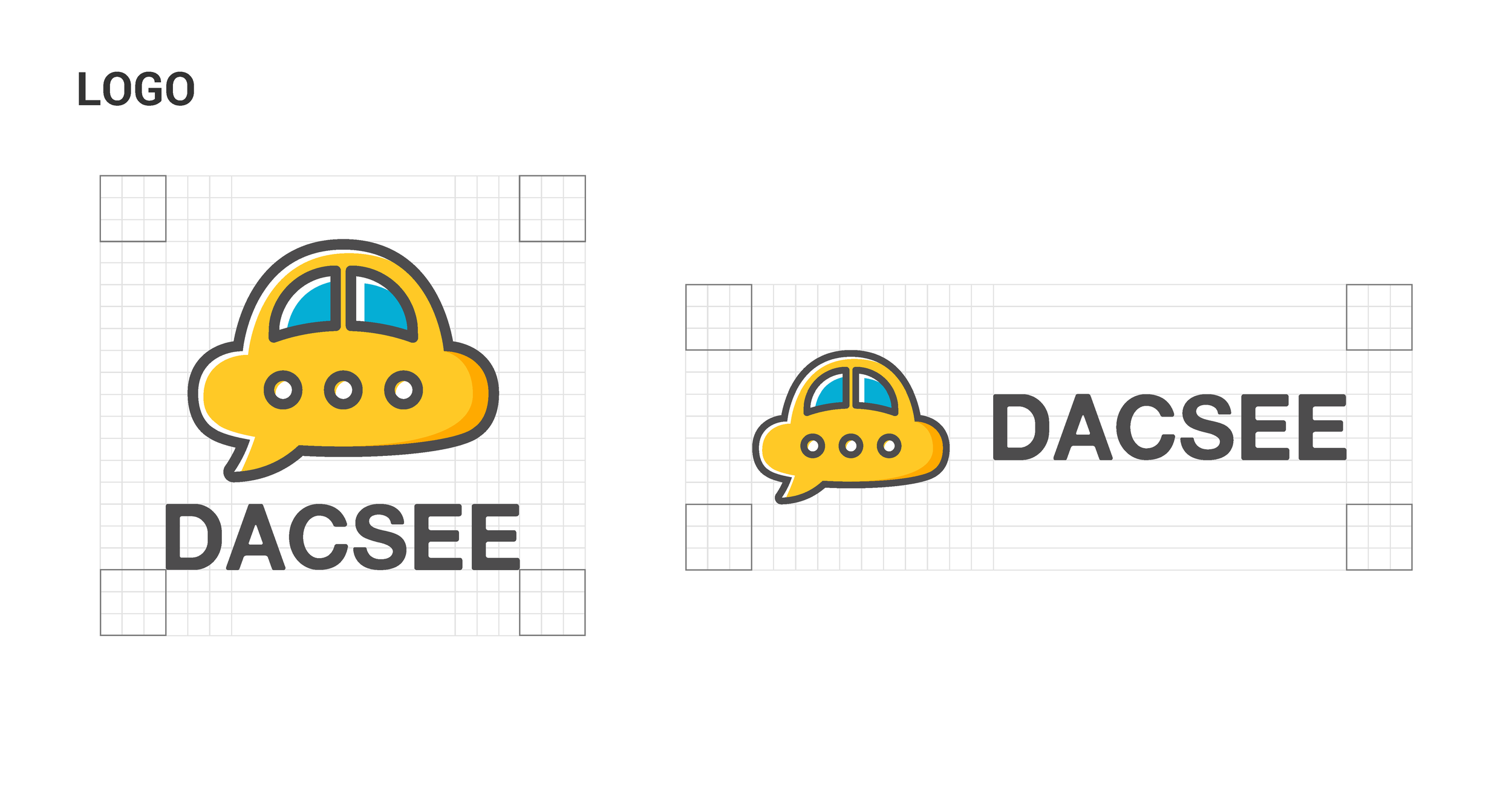
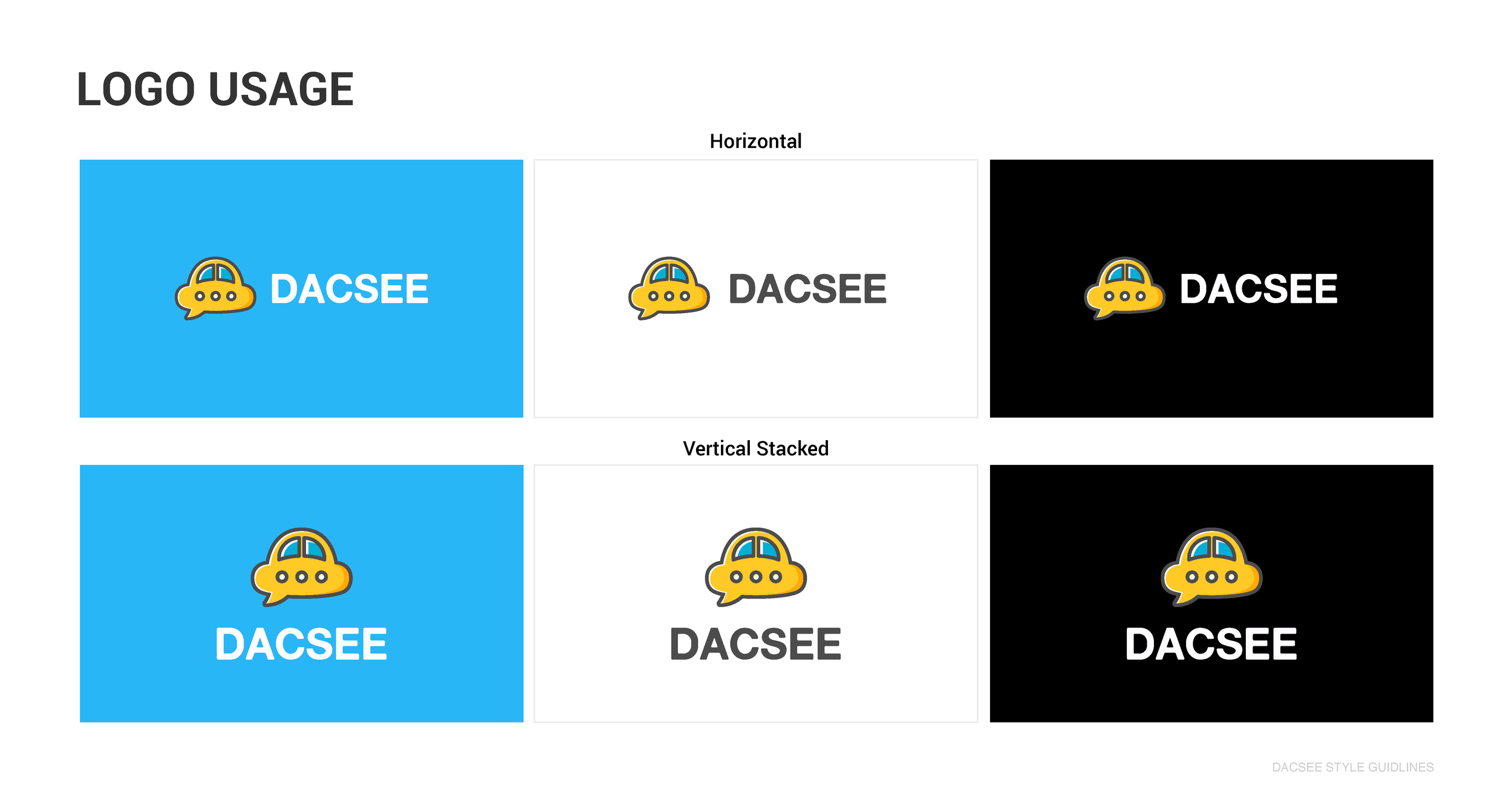
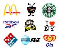
Combination Marks are graphics with both text and a symbol/icon that signifies the brand image that you wish to project for your company or organization. Concise text can complement an icon or symbol, providing supplemental clarity as to what your enterprise is all about.
There are integrated and stand alone combination marks. For instance, Starbucks logo has the text with the graphic integrated, whereas the AT&T logo has the icon separate from the text.
Mobile Application Design
One of the smallest features of every app is the icon used to represent it on the screen of every mobile device and in the app stores. Designing a great icon is more than just putting a logo in a box. You need something that stands out among all the other app icons out there. Novoa’s design process will create an app icon that is easy to read, iconic, scale well, and work well in full color or monochrome.

